
Why measuring urban inequality with the Gini index is a bad idea
The Gini coefficient
In urban policy making, we are often confronted with the need to assess the income inequality of the urban population for such purposes as granting tax cuts to businesses targeting certain income groups, or identifying low-income households for offering housing subsidies in the form of cheap credit. However, wealth or income are not the only quantities the inequality or heterogeneity of which an urban planner would be interested in. For example, urban mobility flows are often concentrated in a few areas capturing a disproportionately large portion of the overall city flows, and knowing how severe this heterogeneity is along with monitoring its trends over time would be the first step towards a meaningful transportation policy, allocation of services and infrastructure such as parking, as well as largely masterplanning.
That said, the most common way to measure inequality is the Gini coefficient which has been in use by economists for more than a hundred years already.
For any distribution of values of interest \(X\) in a city, the Gini coefficient can be defined as:
\[G=\frac{\sum_{i=1}^{n} \sum_{j=1}^{n}\left|x_{i}-x_{j}\right|}{2 n^{2} \bar{x}}\]where \(x_i\) is the \(X\) value at location \(i=[1,2, \ldots, n]\) and \(\bar{x}=(1 / n) \sum_{i} x_{i}\).
As already mentioned, the Gini coefficient, originally used to measure wealth and income inequality, can be applied to quantify the heterogeneity of other variables too. In the case of characterising heterogeneity of values at different locations in a city, as can be seen from the above equation, the Gini coefficient will take on the value of zero if the variable of interest is distributed uniformly across city locations. Conversely, it takes on its maximum value when all of the variables of interest are concentrated in a single location, leading to a Gini coefficient of \(GI=1−1/n\), which is very close to 1 for large \(n\).
Computing the Gini coefficient
Let’s make things clear with an example. Let’s say we want to understand how unequal parking demand is distributed in London, and use the Gini coefficient as a measure of this inequality. Below is a plot of what it looks like for the available data at a resolution of \(500 \times 500\)m grid.
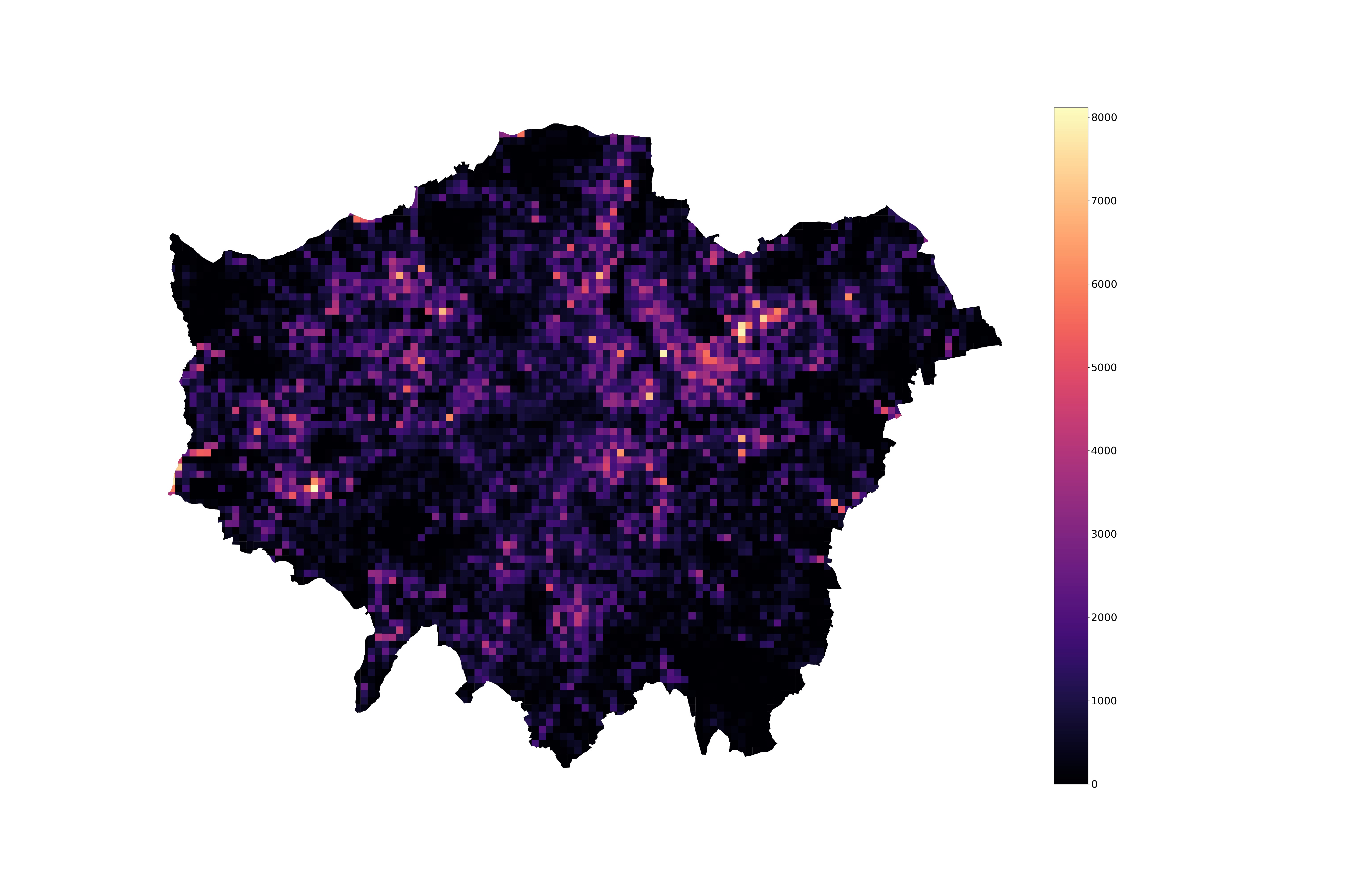
As one might expect, we see hotspots of high parking demand. Indeed, if we look at the distribution of the number of trips ending in a given location over a week (essentially weekly aggregate parking demand),
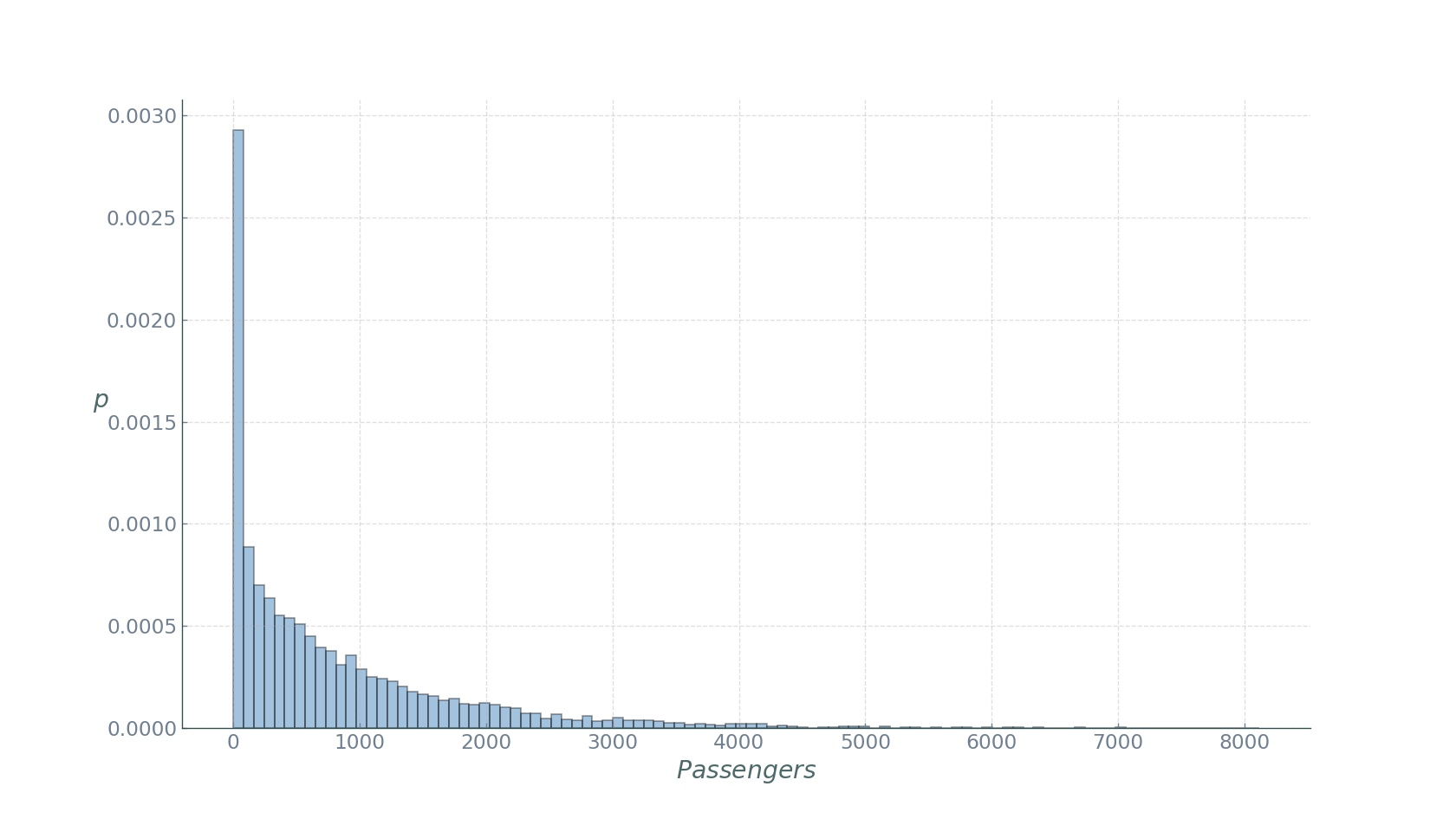
we see an assymatric Pareto-like distribution, with a few locations displaying very high, and most locations very low demand. If we compute the Gini coefficient with the expression above, we obtain a value of roughly 0.6. Although the temporal evolution of this measure would be more meaningful to track, this value indicates a medium-high inequality if thought of in economic terms.
So what’s wrong with it?
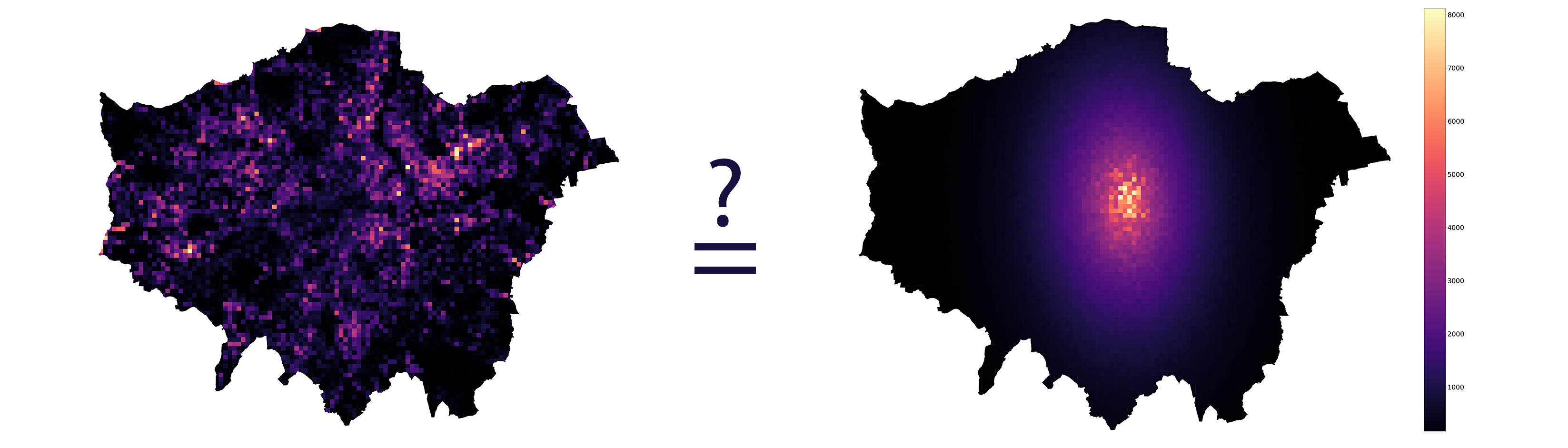
In the definition of the Gini coefficient, we mentioned a key word: location. Urban planning is first and foremost about space. Whether it’s design, management, logistics, or planning, practitioners are working with space. But look carefully at the definition of the widely used Gini coefficient: space - in this case geographical - does not figure in it. The Gini coefficient is completely agnostic to the spatial arrangement of the location of the values of interest. The following four arrangements - the true parking demand and its spatially reshuffled configurations have the exact same Gini coefficient:
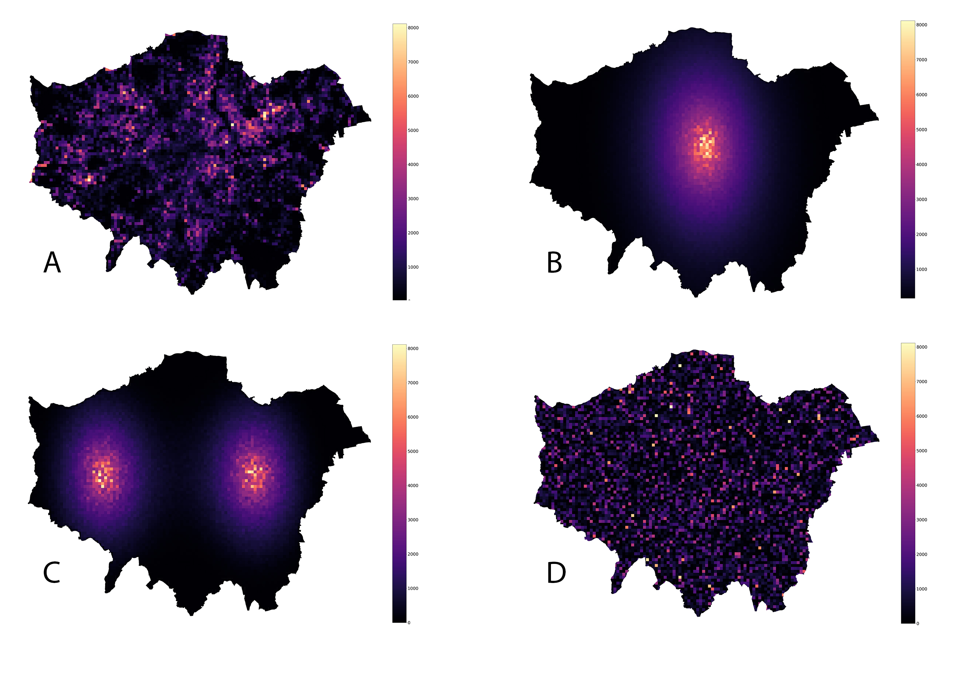
In other words, the Gini coefficient fails to capture any spatial information about our variable of interest.
What should we do?
In the field of spatial statistics there have been proposed many measures indicative of the spatial component of the variable under study. We will discuss two of them which I find particularly useful to combine with the Gini coefficient when studying the urban environment.
Spatial Gini
In order to obtain a Gini coefficient that carries meaningful spatial information, we further use the Spatial Gini index. In essence, it is a decomposition of the classical Gini with the aim of considering the joint effects of inequality and spatial autocorrelation. More specifically, it exploits the fact that the sum of all pairwise differences can be decomposed into sums of geographical neighbours and non-neighbours:
\[G I=\frac{\sum_{i=1}^{n} \sum_{j=1}^{n} w_{i, j}^{A}\left| x_{i}- x_{j}\right|}{2 n^{2} \bar{x}}+\frac{\sum_{i=1}^{n} \sum_{j=1}^{n}\left(1-w_{i, j}^{A}\right)\left| x_{i}- x_{j}\right|}{2 n^{2} \bar{x}}\]where \(w_{i, j}^{A}\) is an element of the binary spatial adjacency matrix. The Spatial Gini index can be interpreted as follows: as the positive spatial auto-correlation increases, the second term in the equation above increases relative to the first, since geographically adjacent values will tend to take on similar values. On the contrary, negative spatial autocorrelation will cause an opposite decomposition, since the difference between non-neighbours will tend to be less than that between geographical neighbours. In either case, this offers the possibility to quantify the relative contributions of these two terms. The results obtained from this approach can further be tested for statistical significance by using random spatial permutations to obtain a sampling distribution under the null hypothesis that the variable of interest is randomly distributed in space.
In essence, we are interested in finding how much of the Gini coefficient is due to non neighbour heterogeneity. To achieve this, we use the non-neighbour term in the Gini decomposition above as a statisticto test for spatial autocorrelation:
\[G I_{2}=\frac{\sum_{i=1}^{n} \sum_{j=1}^{n}\left(1-w_{i, j}^{A}\right)\left| x_{i} - x_{j}\right|}{2 n^{2} \bar{x}}\]This expression can be interpreted as the portion of overall heterogeneity associated with non-neighbour pairs of grid cells. Inference on this statistic is carried out by computing a pseudo p-value by comparing the \(GI_2\) obtained from the observed data to the distribution of \(GI_2\) values obtained from random spatial permutations. It should be noted that this inference based on random spatial permutations is on the spatial decomposition of the Gini coefficient given by the expression above, and not the value of the Gini coefficient itself.
Following the described approach, we proceed to computing the spatial decompositions of the Gini coefficient, varying the neighbourhood radius in the adjacency matrix from 0 (original Gini) to 6 kilometers:
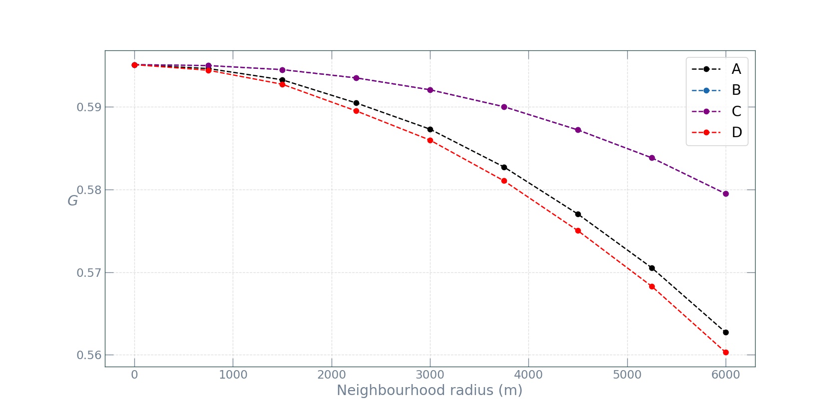
The random spatial permutation approach yielded a statistically significant spatial decomposition (p = 0.01). From the plot we can see that as the neighbourhood radius increases, the inequality due to non-neighbour parking demand values decreases, since the growing neighbourhood captures more and more of the inequality. What’s interesting, however, is the fact that the observed value distribution and the randomized one have similar spatial gini profiles (A and D in the plot), while the two reshufflings with Gaussian distibutions of the parking values (B and C) display the exact same profiles, which decline slower than those of A and D. This is completely expected, since in a Gaussian decay the decline is “smooth” and thus increasing the radius does not make the neighbourhood capture as much diversity, and thus the inequality associated to the non-neighbour component remains relatively high.
Spreading index
Despite their informative relevance, the Gini coefficient and its spatial variant exploit the mean \(\bar{x}\), which, under fat-tailed distributions, as many socio-economic variables tend to be, may be undefined. In such cases, the Gini coefficient cannot be reliably estimated with non-parametric methods and will result in a downward bias emerging under fat tails.
Another downside of measuring heterogeneity of the parking demand with the Gini approach is that it does not offer the possibility to study the spatial arrangement of the “hotspots” - locations with very large demand. The hotspots are defined as the grid cells with a parking demand above a certain threshold \(\bar{x^{\star}}\). The intuitive first choice of a threshold would be the city-wide average demand. However, this is often too low a threshold and a better approach has been proposed. Once the threshold has been chosen and the hotspots are identified as cells with parking demand values larger than the chosen threshold \(\bar{x^{\star}}\), we can use the recently proposed spreading index to measure the ratio between average distance between the hotspots, and the average city distance as a measure of city size:
\[\eta\left(x^{\star}\right) = \frac{\frac{1}{N\left(x^{\star}\right)} \sum_{i, j} d(i, j) 1_{\left(x_{i}>x^{\star}\right)} 1_{\left(x_{j}>x^{\star}\right)}}{\frac{1}{N} \sum_{i, j} d(i, j)}\]where \(N(x^{\star})\) is the number of pairwise distances of grid cells with a parking demand greater than \(\bar{x^{\star}}\), \(N\) is the number of pairwise distances between all grid cells covering the city, \(d(i,j)\) is the distance between cell \(i\) and cell \(j\), and \(1_{\left(x_{i}>x^{\star}\right)}\) is the indicator function for identifying the cells with praking demand greater than \(\bar{x^{\star}}\) for computing the distances. The spreading index is essentially the average distance between cells with \(\left(x_{i}>x^{\star}\right)\), divided by the average distance between all city cells. If the cells with large parking demand are spread around across the city, this ratio will be large. Conversely,if the high demand cells are concentrated close to each other, as in a monocentric city, this ratio will be small.
Instead of choosing one particular threshold value, we will set it as a parameter and see how the spreading index behaves as a function of the threshold \(\bar{x^{\star}}\) for the four types of spatial arrangements.
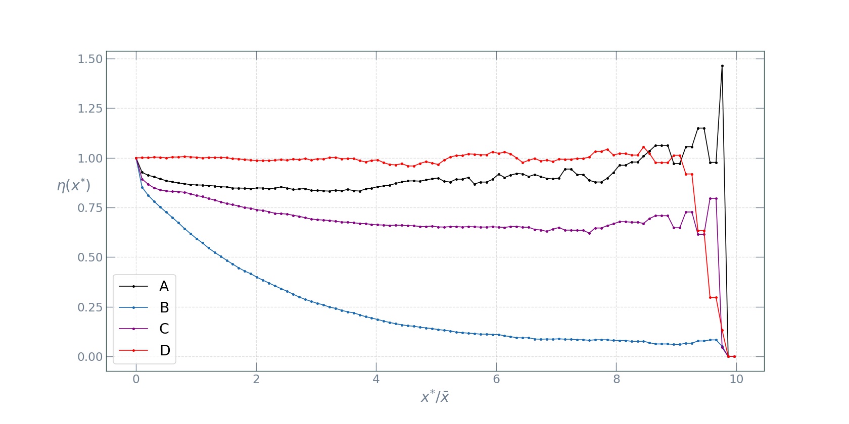
As we can see from the plot, the completely random reshuffling (D) displays the highest spreading index profile, followed by the observad data (A). The two peak Gaussian reshuffling (C) follows next, with the monocentric Gaussian reshuffling profile dropping rapidly as the threshold increases. These four types of spreading index profiles make a more or less complete classification of broad mono- versus poly-centric structures to be found in the spatial arrangements of socio-economic quantities in cities. A mono-centric spatial configuration will result in a rapid decline of the profile and an overall low spreading index, while a polycentric configuration will have an overall high spreading index.
In the use case of working with the spatial distibution of parking demand in London, we see that it has hotspots spread across the city, making for a polycentric spatial structure.
Conclusion
In the coming era of rich data streams from a myriad of sources in cities, it becomes ever more important to devise and apply simple indicators capturing and providing meaningful information to the urban planner and policy maker. In this post, we have discussed the Gini coefficient as a measure of heterogeneity of a distribution of values, shown its shortcomings with a simple trick, and presented methods for complementing it with other metrics capable of capturing spatial information.
The jupyter notebook with the code for this post can be found here.