
Love
Urban policy in the time of Cholera Coronavirus
You can learn the entire modelling, simulation and spatial visualisation of the epidemic spreading in cities using just Python in this online course or in this one.
Are cities prepared for epidemics?
The recent 2019-nCoV Wuhan coronavirus outbreak in China has sent shocks through financial markets and entire economies, and has duly triggered panic among the general population around the world. On 30 January 2020, 2019-nCoV was even designated a global health emergency by the World Health Organization (WHO). At the time of this writing, no specific treatment verified by medical research standards has yet been discovered. Moreover, some key epidemiological metrics such as the basic reproduction number (the average number of people infected by an ill individual) are still unknown. In our times of unprecedented global connectedness and mobility, such epidemics are a major threat on a global scale due to small world network effects. One could conjecture that conditional on a global catastrophic event (loosely defined as > 100mln casualties) happening in 2020, the most likely cause would be precisely some pandemic - not a nuclear disaster, not climate catastrophe, etc. This is further aggravated by worldwide rapid urbanisation, with our densely populated dynamic cities turning into propagation nodes in the disease diffusion network, thus becoming extremely vulnerable and fragile.
In this post, we will discuss what can happen when an epidemic strikes a city, what measures should immediately be taken, and what implications this has for urban planning, policy making, and management. We will take the city of Yerevan as our case study and will mathematically model and simulate the spread of the coronavirus in the city, looking at how urban mobility patterns affect the spread of the disease.
Urban mobility
Effective, efficient, and sustainable urban mobility is of crucial importance for the functioning of modern cities. It has been shown to directly affect livability and economic output (GDP) of cities. However, in the event of an epidemic, it will add fuel to the fire, amplifyig and propagating the disease spread.
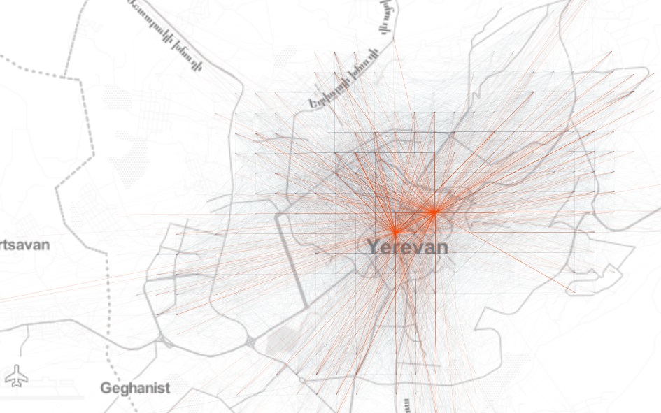
So let’s begin by looking at the network of aggregated origin-destination (\(OD\)) flows on a uniform Cartesian grid in Yerevan to get an idea about the spatial structure of mobility patterns in the city:
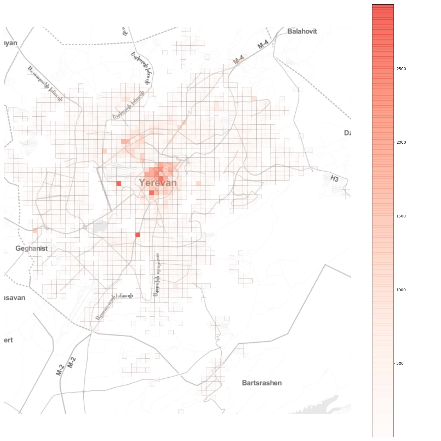
Further, if we look at the total inflow to the grid cells, we see a more or less monocentric spatial organisation with some cells with high daily inflow located off the center:
Now, imagine that an epidemic breaks out at a random location in the city. How will it spread? What can be done to contain it?
Modelling the epidemic
To answer these questions, we will build a simple compartmental model to simulate the spread of the infectuous disease in the city. As an epidemic breaks out, its transmission dynamics varies significantly, depending on the geographical locations of the initial infection and its connectivity with the rest of the city. This is one of the most important insights gained from recent, data-driven studies on epidemics in urban populations. However, as we will see further below, the various outcomes call for similar measures to contain the epidemic and to account for such a possibility in planning and managing cities.
Since runnning individual-based epidemic models is challening, and since our goal is to show general principles of epidemic spread in cities, and not to build a minutely calibrated and accurate epidemic model, we will follow the approach described in this Nature article, modifying the described classical SIR model for our needs.
The model divides the population in four compartments. For each location \(i\) at time \(t\), the four compartments are as follows:
- \(S_{i, t}\): the number of individuals not yet infected or susceptible to the disease.
- \(E_{i, t}\): the number of individuals infected but not yet infectious.
- \(I_{i, t}\): the number of individuals infected with the disease and capable of spreading the disease to those in the susceptible group.
- \(R_{i, t}\): the number of individuals who have been infected and then removed from the infected group, either due to recovery or due to death. Individuals in this group are not capable of contracting the disease again or transmitting the infection to others.
In our simulations, time will be a discrete variable as the state of the system is modelled at a daily basis. In a fully susceptible population at location \(j\) at time \(t\), an outbreak happens with probability:
\[h(t, j)=\frac{\beta_{t} S_{j, t}\left(1-\exp \left(-\sum_{k} m_{j, k}^{t} x_{k, t} y_{j, t}\right)\right)}{1+\beta_{t} y_{j, t}},\]where \(\beta_{t}\) is the transmission rate on day \(t\); \(m_{j, k}^{t}\) reflects mobility from location k to location j, \(x_{k, t}\) and \(y_{k, t}\) denote the fraction of the infected and susceptible populations on day \(t\) at location \(k\) and location \(j\), respectively, given by \(x_{k, t}=\frac{I_{k, t}}{N_{k}}\) and \(y_{j, t}=\frac{S_{j, t}}{N_{j}}\), where \(N_k\) and \(N_j\) are the population sizes at the locations \(k\) and \(j\). Then we go ahead and simulate a stochastic process introducing the disease into locations with entirely susceptible populations, with \(I_{j, t+1}\) being a Bernoulli random variable with probability \(h(t, j)\).
Once the infections are introduced at random locations, the disease spreads both within those locations and is carried and transmitted in other locations by travelling individuals. This is where the urban mobility patterns characterised by the \(OD\) flow matrix play a crucial role.
Further, to formalise how the disease is transmitted by an infected person, we need the basic reproduction number, \(R_0\). It is defined as \(R_0 = \beta_{t}/\gamma\) where \(\gamma\) is the recovery rate, and can be thought of as the expected number of secondary infections after an infected individual comes into contact with a susceptible population. At the time of this writing, the basic reproduction number for the Wuhan coronavirus has been estimated to be between 1.4 and 4. Let’s take the most frequently used average value of 2.4. However, we should note that it’s actually a random variable and the reported number is but the expected number.
We can now proceed to the model dynamics:
\[\begin{equation} \begin{aligned} S_{j, t+1} &=S_{j, t} - S_{j, t}\frac{ I_{j, t}}{P_{j}} \frac{R_0}{D_{I}} + \sum_{k} s_{j, k}^{t} \alpha_{j, k}^{t} - \sum_{k} s_{k, j}^{t} \alpha_{k, j}^{t} \\ E_{j, t+1} &=E_{j, t} + S_{j, t}\frac{ I_{j, t}}{P_{j}} \frac{R_0}{D_{I}} - \frac{E_{j, t}}{D_{E}} + \sum_{k} e_{j, k}^{t} \alpha_{j, k}^{t} - \sum_{k} e_{k, j}^{t} \alpha_{k, j}^{t} \\ I_{j, t+1} &=I_{j, t} + \frac{E_{j, t}}{D_{E}} - \frac{I_{j, t}}{D_{I}} + \sum_{k} i_{j, k}^{t} \alpha_{j, k}^{t} - \sum_{k} i_{k, j}^{t} \alpha_{k, j}^{t} \\ R_{j, t+1} &=R_{j, t} + \frac{I_{j, t}}{D_{I}} + \sum_{k} r_{j, k}^{t} \alpha_{j, k}^{t} - \sum_{k} r_{k, j}^{t} \alpha_{k, j}^{t}, \end{aligned} \end{equation}\]where
- \(P_{j}\) is the population in cell \(j\),
- \(R_0\) is the basic reproduction number,
- \(D_{E}\) is the incubation period, i.e., \(t_{first symptom} - t_{infected}\), with the assumption that during the incubation period the disease can’t be transmitted (which is not the case in real life!)
- \(D_{I}\) is the infection period, i.e., the period the person can infect others,
- \(s_{j, k}^{t}\) is the number of susceptible people that went from cell \(k\) to cell \(j\) at time \(t\),
- \(\alpha_{j, k}^{t}\) is a parameter specifying the quarantine strength or the modal share or the intensity of public transport vs. private car travel modes in the city..
The model dynamics described in the above equations are very simple: on day \(t+1\) at location \(j\), we need to subtract from the susceptible population \(S_{j, t}\) the fraction of people infected within location \(j\) (the second term in the first equation) and the number of susceptible people that have arrived from other locations in the city (the third term in the first equation), and we need to add the number of susceptible people that have left cell \(j\) to other locations in the city (the last term in the first equation). The other equations follow the same logic for the remaining E, I, and R groups.
Simulation setup
For this analysis, we will use the aggregated \(OD\) flow matrix of a typical day obtained from GPS data provided by local ride sharing company gg as a proxy for the mobility patterns in Yerevan city. Next, we need the population counts in each \(250 \times 250m\) grid cell, which we approximate by proportionally scaling the extracted flow counts so that the total inflows in different locations sum up to approximately half of Yerevan’s population of 1.1 million. This is actually a bold assumption, but since varying this portion yielded very similar results, we will stick to it.
Reduce public transport?
For our first simulation, we will imagine a sustainable public transport-dominated future urban mobility with \(\alpha=0.9\):
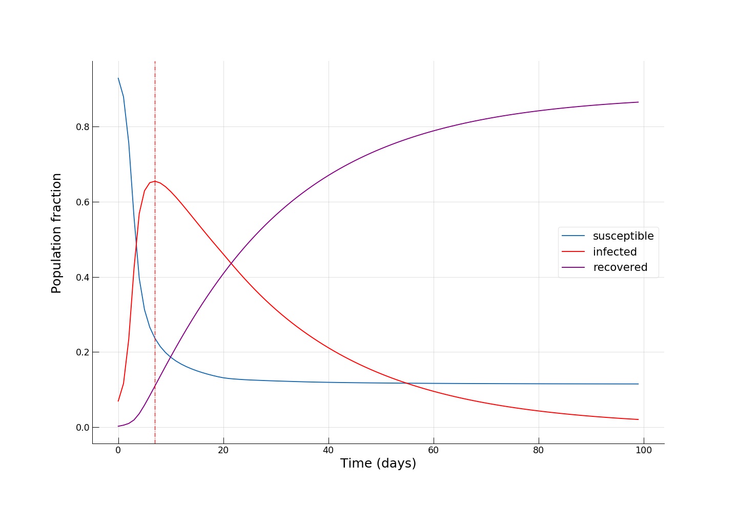
We see how fast the infected fraction of the population is climbing up immediately, reaching the epidemic’s peak on around day 8-10, with almost 70% of the population infected, while only a small portion (~10%) of the population having recovered from the disease. Towards day 100, when the epidemic has receded, we see the fraction of recovered individuals reach a staggering 90%! Now let’s see if reducing the intensity of public transport travel to something like \(\alpha=0.2\) has any effect on mitigating the epidemic spread. This can either be interpreted as taking drastic measures to reduce urban mobility (e.g., by issuing a curfew) or as increasing the share of private car travel to reduce chances of infection during the travel.
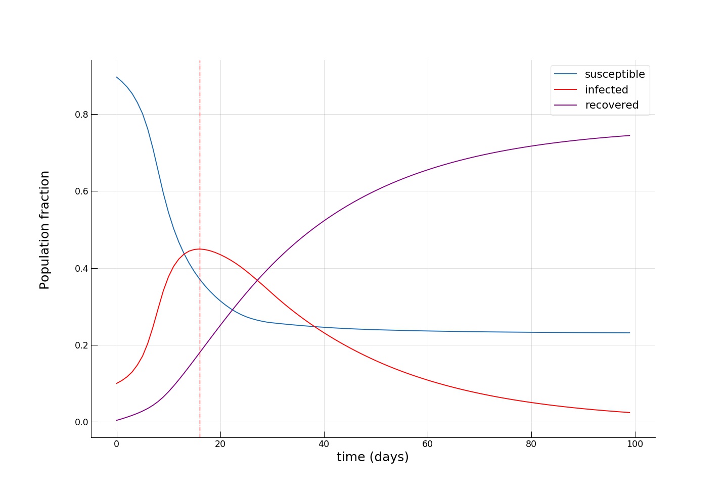
We see how the peak of the epidemic comes somewhere between day 16 and 20, with a significantly smaller infected group (~45%) and twice as many recovered (~20%). Towards the end of the epidemic, the fraction of susceptible individuals is also twice as big (~24% vs. ~12%), meaning that more people have escaped the disease. As expected, we see that the introduction of dramatic measures to temporarily bring urban mobility down has a big impact on the disease spreading dynamics.
Quarantine popular locations?
Now, let’s see whether another intuitive idea of completely cutting off a few key popular locations has the desired effect. To do this, let’s pick the locations associated with the upper 1 percentile of mobility flows,
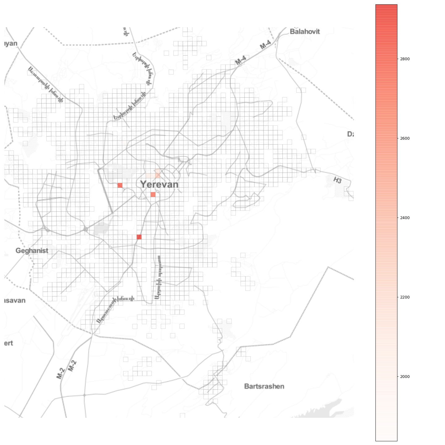
and completely block all flow to and from those locations, effectively establishing there a quarantine regime. As we can see from the plot, in Yerevan these locations are mostly in the city center, with two other locations being the two largest shopping malls. Choosing a moderate \(\alpha = 0.5\), we obtain:
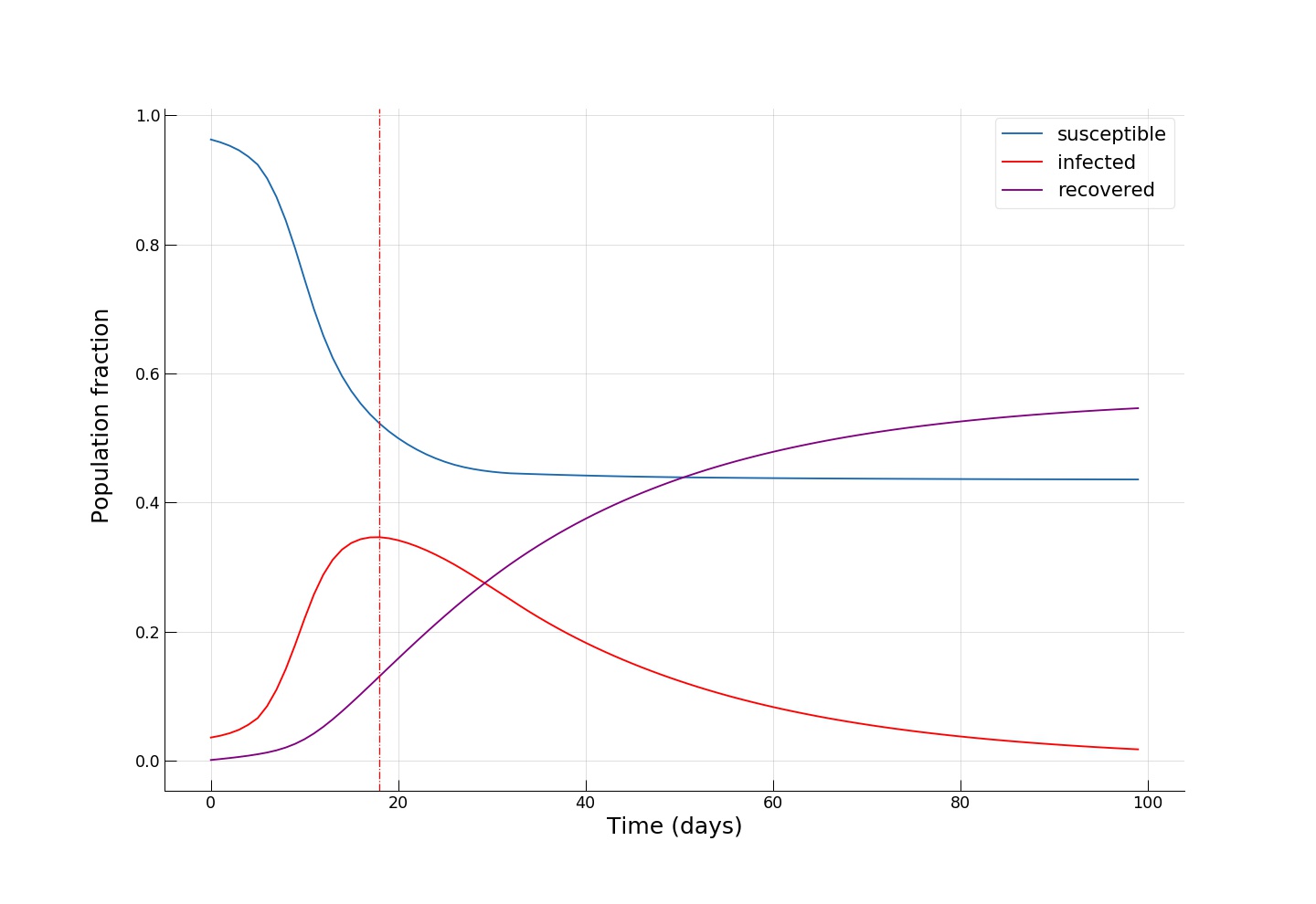
We see an even smaller fraction of infected individuals at the epidemic’s peak (~35%), and, most importantly, we see that towards the end of the epidemic, around half of the population remains susceptible, effectively escaping from contracting the infection!
Python code for running the epidemic spread model
  import numpy as np
from collections import namedtuple

Param = namedtuple('Param', 'R0 DE DI I0 HospitalisationRate HospitalIters')
# I0 is the distribution of infected people at time t=0, if None then randomly choose inf number of people

# flow is a 3D matrix of dimensions r x n x n (i.e., 84 x 549 x 549),
# flow[t mod r] is the desired OD matrix at time t.

def seir(par, distr, flow, alpha, iterations, inf):

    r = flow.shape[0]
    n = flow.shape[1]
    N = distr[0].sum() # total population, we assume that N = sum(flow)

    Svec = distr[0].copy()
    Evec = np.zeros(n)
    Ivec = np.zeros(n)
    Rvec = np.zeros(n)

    if par.I0 is None:
        initial = np.zeros(n)
        # randomly choose inf infections
        for i in range(inf):
            loc = np.random.randint(n)
            if (Svec[loc] > initial[loc]):
                initial[loc] += 1.0

    else:
        initial = par.I0
    assert ((Svec < initial).sum() == 0)

    Svec -= initial
    Ivec += initial

    res = np.zeros((iterations, 5))
    res[0,:] = [Svec.sum(), Evec.sum(), Ivec.sum(), Rvec.sum(), 0]

    realflow = flow.copy() # copy!

    # The two lines below normalise the flows and then multiply them by the alpha values.
    # This is actually the "wrong" the way to do it because alpha will not be a *linear* measure
    # representing lockdown strength but a *nonlinear* one.
    # The normalisation strategy has been chosen for demonstration purposes of numpy functionality.
    # (Optional) can you rewrite this part so that alpha remains a linear measure of lockdown strength? :)
    realflow = realflow / realflow.sum(axis=2)[:,:, np.newaxis]
    realflow = alpha * realflow

    history = np.zeros((iterations, 5, n))
    history[0,0,:] = Svec
    history[0,1,:] = Evec
    history[0,2,:] = Ivec
    history[0,3,:] = Rvec

    eachIter = np.zeros(iterations + 1)

    # run simulation
    for iter in range(0, iterations - 1):
        realOD = realflow[iter % r]

        d = distr[iter % r] + 1

        if ((d>N+1).any()): #assertion!
            print("Houston, we have a problem!")
            return res, history
        # N =  S + E + I + R

        newE = Svec * Ivec / d * (par.R0 / par.DI)
        newI = Evec / par.DE
        newR = Ivec / par.DI

        Svec -= newE
        Svec = (Svec
               + np.matmul(Svec.reshape(1,n), realOD)
               - Svec * realOD.sum(axis=1)
                )
        Evec = Evec + newE - newI
        Evec = (Evec
               + np.matmul(Evec.reshape(1,n), realOD)
               - Evec * realOD.sum(axis=1)
                )

        Ivec = Ivec + newI - newR
        Ivec = (Ivec
               + np.matmul(Ivec.reshape(1,n), realOD)
               - Ivec * realOD.sum(axis=1)
                )

        Rvec += newR
        Rvec = (Rvec
               + np.matmul(Rvec.reshape(1,n), realOD)
               - Rvec * realOD.sum(axis=1)
                )

        res[iter + 1,:] = [Svec.sum(), Evec.sum(), Ivec.sum(), Rvec.sum(), 0]
        eachIter[iter + 1] = newI.sum()
        res[iter + 1, 4] = eachIter[max(0, iter - par.HospitalIters) : iter].sum() * par.HospitalisationRate

        history[iter + 1,0,:] = Svec
        history[iter + 1,1,:] = Evec
        history[iter + 1,2,:] = Ivec
        history[iter + 1,3,:] = Rvec


    return res, history
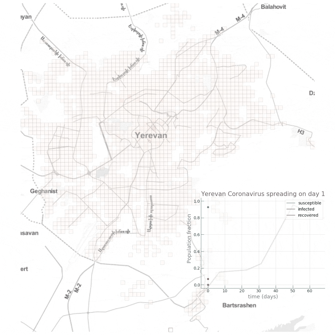
Here is a small animation visualising the dynamics of the high public transport share scenario:
Conclusion
By no means claiming accurate epidemic modelling (or even any substantial knowledge in epidemiology beyond the basics), our aim in this post was to get a first insight on how network effects come into play in an urban setting during an infectuous disease outbreak. With ever increasing population densities, mobility, and dynamics, our cities become more exposed to “black swans” and become more fragile. And since you can’t fetch the coffee if you’re dead, smart and sustainable cities will be meaningless without effective and efficient crisis handling capability and mechanisms. For instance, we saw that the introduction of quarantine regimes in key locations, or taking draconian measures to curb mobility, can be instrumental during such a health crisis. However, a further important question would be how to implement such measures while minimizing damage and loss to the functioning of the city and its economy?
Further yet, the exact epidemic spreading mechanisms of infectuous diseases are still an active area of research and the advances in this fields will have to be communicated to and integrated in urban planning, policy making, and management to make our cities safe and antifragile.